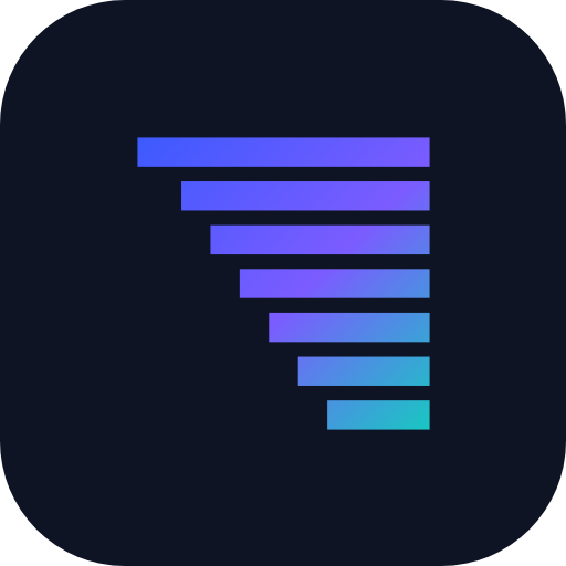
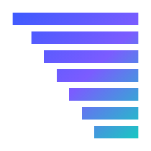
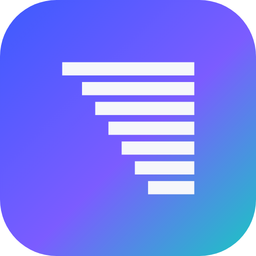
One mark, seven bars.
Seven descending bars, each one shorter than the last — the seven layers of a stack, read top to bottom. It is the whole identity: there is no second mark, no seasonal variant and no illustration library standing in for one. Everything below is the same geometry in a different treatment.
This page exists so the mark stays the mark. If you are putting Seven Layers on an invoice, a slide, a shirt or someone else's site, take the files from here rather than lifting a screenshot.
Four grounds, one shape.
The mark is drawn as vector geometry that inherits its colour from whatever it sits on, so a single asset covers the light theme, the dark theme and every palette the site ships with. Pick by ground, not by file.
Mark and name, locked together.
The spacing between mark and name is a ratio of the mark's own size, so the lockup keeps its proportions at any scale. Resize the whole thing — never one half of it.
Three brand colours and two grounds.
The gradient runs blue to teal across the mark once — not per bar. Violet is a waypoint inside it and is never used flat on its own.
Clear space and minimum size.
Clear space
Keep clear space equal to the height of one bar on every side. The mark already carries that padding inside its own viewBox, so an SVG placed flush is correct — the dashed line shows where the boundary falls.
Minimum size
16px for the mark alone, 24px inside a lockup. Below 16px the gap between the bottom two bars closes up and the shape reads as a solid wedge rather than seven layers.
Scale the lockup as one unit. Use the reversed mark on dark grounds. Take the files from this page.
Use the single-colour mark wherever the gradient will not survive — one-colour print, embroidery, a fax, a favicon at 16px.
Recolour the bars individually, rotate or mirror the mark, add a stroke or shadow, or stretch it to a non-square box.
Set the name in a different typeface, place the mark on a busy photograph, or rebuild it by eye — the geometry is exact.
Download the source.
Vector wherever vector works. Every file here is generated from the same geometry this page is drawn from, so none of them can fall out of step with the site.


Want an identity that holds together like this?
Logo, palette, type and the rules that keep them consistent — built as a system rather than a single file emailed over. It is one of the things we do.
- 01Honest, practical advice
- 02A clear fixed-price quote
- 03A realistic timeline
- 04No pressure, no jargon